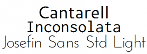
![]() I’ve been interested in web fonts for a while now, so I was rather excited when the Google Font Directory was released last month.
I’ve been interested in web fonts for a while now, so I was rather excited when the Google Font Directory was released last month.
Am I the only one who’s not really impressed with it?
Don’t get me wrong — the technology rocks; it’s an easy way to get non-standard, licensed web fonts into your site. No, my beef is with the fonts themselves.
To my non-typographically-expert eye, half of them are indistinguishable from current web-safe fonts (e.g. Nobile and Vollkorn). Why bother making the user download a font that looks like something that they’ve already got on their system?
 Another 40% look like crap, at least on my PC. They have way too many jagged edges to be used on a live web site. (I’ve looked at the page in Firefox, Chrome, and Safari — they’re all about the same.)
The remaining couple of fonts are pretty good: I’ve already used Lobster as a choice for creating customized Match The Memory games, and I predict that we’ll see a lot of blogs with headlines set in Yanone Kaffeesatz and Reenie Beanie soon.
I realize that the existence of a project like this would have been unthinkable just a few years ago, when type foundries would have completely freaked out at the thought of their cash-cow fonts being accessible from a web site. I understand that these fonts are probably just the beginning, that they’re working on adding more and better typefaces as they bring on board more type designers.
But I say, “Okay first try, but hurry it up already!” The selection of fonts that’s online through GFD right now just isn’t that impressive.